Next.js Highlight Current Page Link – How to Highlight the Active Link in Next.js

Written by Kolade Chris | Aug 17, 2024 | #Next.js #React | 7 minute Read
Creating a user-friendly navigation system is essential for any website, and highlighting the current page link in the navbar is an integral aspect of that.
In Next.js, a popular React framework, implementing this feature can improve user experience by visually indicating the current page or section the user is visiting. This not only guides users through your site content, it also adds a touch of elegance to the website design.
There are many ways you can highlight the active navlink in Next.jsand React. The popular way of doing it with React is using the react-router package. In Next JS, we used to do it with the userRouter hook.
This article will take you through the new Next JS way of highlighting the active navlink, particularly in Next 14, and that’s using the usePathname hook.
The Navbar we are Working with
The navbar we are using for this guide has already been prepared for you with Tailwind CSS. You can expand the code to see it in full.
'use client';import { useState } from 'react';import Link from 'next/link';
const Navbar = () => { const [isOpen, setIsOpen] = useState(false);
133 collapsed lines
const toggleMenu = () => { setIsOpen(!isOpen); };
const handleClick = () => { setIsOpen(false); };
return ( <nav className="bg-green-700"> <div className="max-w-7xl mx-auto px-4 sm:px-6 lg:px-8 lg:py-3"> <div className="flex items-center justify-between h-16"> <div className="flex-shrink-0"> <Link href="/"> <span className="text-white font-bold text-3xl">Green World</span> </Link> </div> <div className="hidden md:flex"> <div className="flex items-baseline space-x-4 w-full justify-between"> <Link href="/" className=" text-white hover:bg-green-900 hover:text-gray-100 px-3 py-2 rounded-md text-2xl font-medium" > Home </Link> <Link href="/about" className=" text-white hover:bg-green-900 hover:text-gray-100 px-3 py-2 rounded-md text-2xl font-medium" > About </Link> <Link href="/services" className=" text-white hover:bg-green-900 hover:text-gray-100 px-3 py-2 rounded-md text-2xl font-medium" > Services </Link> <Link href="/contact" className=" text-white hover:bg-green-900 hover:text-gray-100 px-3 py-2 rounded-md text-2xl font-medium" > Contact </Link> </div> </div> <div className="-mr-2 flex md:hidden"> <button type="button" className="inline-flex items-center justify-center p-2 rounded-md text-white hover:text-gray-100 hover:bg-green-900 focus:outline-none focus:bg-green-900 focus:text-white transition duration-150 ease-in-out" onClick={toggleMenu} aria-label="Main menu" aria-expanded={isOpen} > <svg className="block h-6 w-6" stroke="currentColor" fill="none" viewBox="0 0 24 24" > {isOpen ? ( <path strokeLinecap="round" strokeLinejoin="round" strokeWidth="2" d="M6 18L18 6M6 6l12 12" /> ) : ( <path strokeLinecap="round" strokeLinejoin="round" strokeWidth="2" d="M4 6h16M4 12h16M4 18h16" /> )} </svg> </button> </div> </div> </div>
{/* Mobile menu */} <div className={`${isOpen ? 'block' : 'hidden'} md:hidden `}> <div className={`${ isOpen ? 'translate-x-0 opacity-100' : 'translate-x-full opacity-0' } px-2 pt-2 pb-3 space-y-1 sm:px-3 `} > <Link href="/" className=" text-white hover:bg-green-900 hover:text-gray-100 block px-3 py-2 rounded-md text-base font-medium" onClick={handleClick} > Home </Link> <Link href="/about" className="text-white hover:bg-green-900 hover:text-gray-100 block px-3 py-2 rounded-md text-base font-medium" onClick={handleClick} > About </Link> <Link href="/services" className="text-white hover:bg-green-900 hover:text-gray-100 block px-3 py-2 rounded-md text-base font-medium" onClick={handleClick} > Services </Link> <Link href="/contact" className=" text-white hover:bg-green-900 hover:text-gray-100 block px-3 py-2 rounded-md text-base font-medium" onClick={handleClick} > Contact </Link> </div> </div> </nav> );};
export default Navbar;What’s the code above doing?
- the
use-clientdirective signifies to React that the component is a client component useStateis imported from React andLinkfrom next link- an
isOpenstate variable is set andsetIsOpento modify the state - a
toggleMenufunction is created to handle the opening and closing of the mobile menu - an
handleClickfunction is created to hide and show the nav items when one of them is selected on the mobile menu
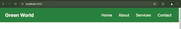
This is what the navbar looks like on a desktop screen:
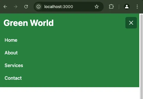
And this is what it looks like on a mobile screen:
How to Use the usePathname Hook to Highlight the Current Page Link
Step 1: Create a new Next JS app with the command below
npx create-next-app@latest # if you're using NPMyarn create next-app # if you're using Yarnpnpm create next-app # if you're using PNPMStep 2: Create a Navbar.jsx component in the root and import the usePathname hook from next/navigation
'use client';import { useState } from 'react';
import Link from 'next/link';import { usePathname } from 'next/navigation';
const Navbar = () => { const [isOpen, setIsOpen] = useState(false);
const toggleMenu = () => { setIsOpen(!isOpen); };
const handleClick = () => { setIsOpen(false); };
return ( <nav className="bg-green-700">{/* Rest of desktop and mobile menu */}</nav> );};
export default Navbar;Step 3: Then you must initialize the usePathname hook
'use client';import { useState } from 'react';
import Link from 'next/link';import { usePathname } from 'next/navigation';
const Navbar = () => { const [isOpen, setIsOpen] = useState(false);
const toggleMenu = () => { setIsOpen(!isOpen); };
const handleClick = () => { setIsOpen(false); };
const pathname = usePathname();
return ( <nav className="bg-green-700">{/* Rest of desktop and mobile menu */}</nav> );};
export default Navbar;Step 4: After that, you have to make the className of each navlink dynamic with the syntax below
className={`${pathname === '/pageFolderName ? 'bg-green-900' : ''}text-white hover:bg-green-900 hover:text-gray-100 px-3 py-2 rounded-md text-2xl font-medium`}For example, the entire services page link and text will now look like this:
<Link href="/services" className={`${ pathname === '/services' ? 'bg-green-900' : '' } text-white hover:bg-green-900 hover:text-gray-100 px-3 py-2 rounded-md text-2xl font-medium`}> Services</Link>And those of the about page will look like this:
<Link href="/about" className={`${ pathname === '/about' ? 'bg-green-900' : '' } text-white hover:bg-green-900 hover:text-gray-100 px-3 py-2 rounded-md text-2xl font-medium`}> About</Link>You must also make the classNames of the mobile items dynamic.
For example, this is what the about page item of the mobile menu will look like:
<Link href="/about" className={`${ pathname === '/about' ? 'bg-green-900' : '' } text-white hover:bg-green-900 hover:text-gray-100 block px-3 py-2 rounded-md text-base font-medium`} onClick={handleClick}> About</Link>After making all the necessary changes, the entire Navbar component should be this:
'use client';import { useState } from 'react';
import Link from 'next/link';import { usePathname } from 'next/navigation';
const Navbar = () => {133 collapsed lines
const [isOpen, setIsOpen] = useState(false);
const toggleMenu = () => { setIsOpen(!isOpen); };
const handleClick = () => { setIsOpen(false); };
const pathname = usePathname();
return ( <nav className="bg-green-700"> <div className="max-w-7xl mx-auto px-4 sm:px-6 lg:px-8 lg:py-3"> <div className="flex items-center justify-between h-16"> <div className="flex-shrink-0"> <Link href="/"> <span className="text-white font-bold text-3xl">Green World</span> </Link> </div> <div className="hidden md:flex"> <div className="flex items-baseline space-x-4 w-full justify-between"> <Link href="/" className={`${ pathname === '/' ? 'bg-green-900' : '' } text-white hover:bg-green-900 hover:text-gray-100 px-3 py-2 rounded-md text-2xl font-medium`} > Home </Link> <Link href="/about" className={`${ pathname === '/about' ? 'bg-green-900' : '' } text-white hover:bg-green-900 hover:text-gray-100 px-3 py-2 rounded-md text-2xl font-medium`} > About </Link> <Link href="/services" className={`${ pathname === '/services' ? 'bg-green-900' : '' } text-white hover:bg-green-900 hover:text-gray-100 px-3 py-2 rounded-md text-2xl font-medium`} > Services </Link> <Link href="/contact" className={`${ pathname === '/contact' ? 'bg-green-900' : '' } text-white hover:bg-green-900 hover:text-gray-100 px-3 py-2 rounded-md text-2xl font-medium`} > Contact </Link> </div> </div> <div className="-mr-2 flex md:hidden"> <button type="button" className="inline-flex items-center justify-center p-2 rounded-md text-white hover:text-gray-100 hover:bg-green-900 focus:outline-none focus:bg-green-900 focus:text-white transition duration-150 ease-in-out" onClick={toggleMenu} aria-label="Main menu" aria-expanded={isOpen} > <svg className="block h-6 w-6" stroke="currentColor" fill="none" viewBox="0 0 24 24" > {isOpen ? ( <path strokeLinecap="round" strokeLinejoin="round" strokeWidth="2" d="M6 18L18 6M6 6l12 12" /> ) : ( <path strokeLinecap="round" strokeLinejoin="round" strokeWidth="2" d="M4 6h16M4 12h16M4 18h16" /> )} </svg> </button> </div> </div> </div>
{/* Mobile menu */} <div className={`${isOpen ? 'block' : 'hidden'} md:hidden `}> <div className={`${ isOpen ? 'translate-x-0 opacity-100' : 'translate-x-full opacity-0' } px-2 pt-2 pb-3 space-y-1 sm:px-3 `} > <Link href="/" className={`${ pathname === '/' ? 'bg-green-900' : '' } text-white hover:bg-green-900 hover:text-gray-100 block px-3 py-2 rounded-md text-base font-medium`} onClick={handleClick} > Home </Link> <Link href="/about" className={`${ pathname === '/about' ? 'bg-green-900' : '' } text-white hover:bg-green-900 hover:text-gray-100 block px-3 py-2 rounded-md text-base font-medium`} onClick={handleClick} > About </Link> <Link href="/services" className={`${ pathname === '/services' ? 'bg-green-900' : '' } text-white hover:bg-green-900 hover:text-gray-100 block px-3 py-2 rounded-md text-base font-medium`} onClick={handleClick} > Services </Link> <Link href="/contact" className={`${ pathname === '/contact' ? 'bg-green-900' : '' } text-white hover:bg-green-900 hover:text-gray-100 block px-3 py-2 rounded-md text-base font-medium`} onClick={handleClick} > Contact </Link> </div> </div> </nav> );};
export default Navbar;Don’t forget to expand the code so you can see the changes I made.
Step 5: You then need to import the Navbar component into your layout file and use it.
import '@/assets/styles/globals.css';import Navbar from '@/components/Navbar';
export const metadata = { title: 'Green World | Home of Nature Scenes', description: 'Find the coolest nature images and videos', keywords: 'nature animals trees fields',};
const MainLayout = ({ children }: React.PropsWithChildren<{}>) => { return ( <html> <body> <Navbar /> <main>{children}</main> </body> </html> );};
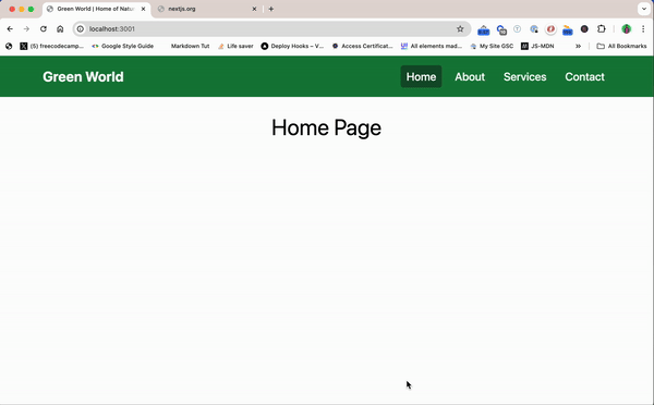
export default MainLayout;The navbar should now look like this on a desktop screen:
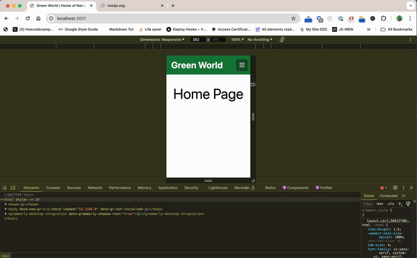
And it should look like this on a mobile screen:
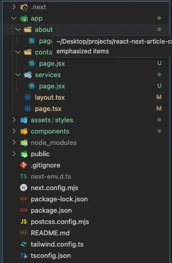
If you’re wondering how I got an item to show for each page, I created each page in the app directory. This is what the folder structure looks like:
Wrapping Up
Highlighting the current page link in the navbar is one of the many critical features you should consider implementing if you have user experience in mind.
This feature not only enhances the user experience, it also strengthens visual design and sends to the user a good perception of your website.
To better understand things, you can grab the code for this article from the project GitHub repo.